

What is a brand?
The definition of a brand is an easily identifiable ingrained mark. Brands make companies stand out from their competitors.
Your brand identity. Where to start?
Dependent on how you’ve structured your business, it could well be that as a start-up SME, you’ve utilised a typeface-based logo and a couple of colours just for consistency for your invoices and day to day correspondence. But now that you’re growing, affiliates and partners need readily formatted logos and your conscientious new member of staff is asking you for letterheads, Word and PowerPoint templates or a video watermark. If you want to avoid grainy, free formed elongated to size representation of your logo, then your identity requires a structured approach.

If possible, create your logo, colour palette and font simultaneously for brand adhesion. All too often your brand identity becomes an afterthought which by then can be more difficult to correct and adhere to.
Brand logo
Even without brand guidelines, second to your company name, a logo is arguably the easiest way to identify your company. Many logos may even use a symbol, icon or logo mark, independent of the company name.

If you don’t know where to start, think of some brand logos that you can immediately identify, and then note the reasons why you can remember them. You may you notice that these logos would be quite easy to draw and to colour in on a piece of paper. In a word “Simple”.
Keeping it simple
Your company logo will invariably be used many times by a multitude of people, whether you have issued brand guidelines or not. Remember too that your logo will to be placed at different sizes, and in online and print formats. Think of the tiny favicon mark on a web browser page:

Your logo or brand mark needs to work at this size, as it would on a large scale - if your company was to sponsor a major sporting event / concert / awards ceremony / venue.
That’s not our logo!
Possibly the greatest misuse of a company’s logo occurs simply because the logo can’t be easily found in the correct format. When you create your original logo, ideally use a vector scalable format (svg) for online use. For print use .eps or .ai. Keep these as original files which can later be used to create most of the common file formats requested i.e. .png .jpg .pdf.
Grayscale and a white versions are also common logo requests, so creating these when working on your original logo should help protect your logo use down the line.

Your brand personality
You now have your brand identity and it is time to start building your brand personality. As the adage goes, people do business with people. We might buy from a salesperson because we like them, we trust them, and want to give them our business. Therefore, look at your brand as a sales force; dress it up and show off your brand personality. Think Red Bull or Harley-Davidson:


As you would for a business meeting, dress your brand personality to suit using consistent fonts. and colours, but remember to avoid overwhelming your content and instead design to complement it.
Colour palette and colour psychology
Have you noticed the frequency of blue hues in traditional colour palettes used for legal, accounting or professional services firm? Blue is the colour of choice for several reasons important to a brand’s identity.
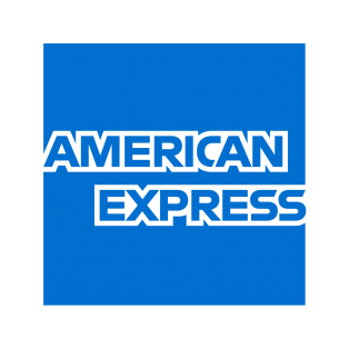
A serious colour, blue represents intelligence, communication, trust and efficiency. Indeed, these traits are the most sort after for any brand. Big brands which revel in their true blue are Facebook, American Express, Dell, IBM, Microsoft, PayPal and Twitter.


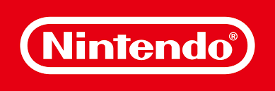
At almost the opposite end brands such as: Coca-Cola, Red Bull, Nintendo and Netflix use a powerful and energetic red.


With a spectrum of colours to choose from, here are some important statistics to bear in mind:
Emotional branding and colour
Science has proven that forging an emotional connection to a company over time leads to brand loyalty and sets a company apart from its competitors. Therefore, if people choose a brand or products based on their emotion, then the look and feel of the brand is paramount.
At the time of writing, results from ongoing online 'Global Color' survey conducted by Colorcom show the colours that people associate the most with different emotions.
Scroll through the images below to see the emotions and colours:


From the data gathered by Colorom, the favourite colour is blue, and the least popular colour is dark yellow.


At the same time and choosing your main brand colour, choose a second colour to accent and a third muted colour to create your palette. Issac Newton's colour wheel is an invaluable tool when deciding on accent, complementary or opposite brand colours. Try Canva's color wheel or Adobe Color, both are free and easy to use.

Fonts: what’s your type?
Legal, accounting and professional services firms? Traditional fonts have tended to be steadfast Arial, Courier, Georgia, Helvetica, Times New Roman or Verdana. Alternative modern, web safe fonts include Microsoft Word’s default Calibri, and then Futura and Garamond.

For your personality to stand out, your chosen font/s will need to render across all platforms including the web, apps and PowerPoint. This is especially poignant if you or your designer uses an Apple keynote font which isn't compatible with PowerPoint. So either avoid using a non-standard font for your brand, or check how it will render i.e. what standard font it will be replaced with if your brand font isn't available on a particular device.
The standout choice of easy to read fonts for slideshows are a mixture of modern and classic: Helvetica, Garamond, Futura, Gill Sans and Rockwell.

Market Research
Although it helps if you like your own logo and branding, the most important opinion is that of your customers and prospects. Do some simple market research to test your proposed logo and branding. Ask colleagues / friends / connections their opinion in a straw poll (giving them at least two options to choose from).
Brand guidelines - grand designs?
Design to complement your content, not overwhelm it. Your brand guidelines should be straightforward with clear logo visuals and templates. Always include font/typeface, brand colours, at least a vector logo and transparent logo (include white and grayscale logos, plus your colour logo on a transparent background for good measure).

Your brand guidelines should be used to equip your staff, partners and for any media requests. These clear instructions will save time trying to source the correct logo, font and colours and help to protect your brand from misuse of your logo.
8 Key branding tips
DO spend time creating your brand. On average it takes seven seconds for people to form an opinion, this applies to your branding too. Test first on colleagues or a focus group
AVOID designing your logo for web use only (at a minimal pixel size). Instead design as a scalable vector or .ai file)
DO remember that your logo needs to be clear when used at a miniature 32 x 32 pixels ie. as a web favicon and then also LinkedIn company profile logo.
AVOID using more than two fonts on one page. Instead utilise the fonts own Italic / bold options or its typeface family variations
Do test your chosen font first to see how it renders on various platforms and whether it's a standard installation
AVOID mixed messaging, you want your brand to stand out but for all the right reasons. Think about your audience and dress your brand to suit.
DO consider colour psychology as part of your branding and use a colour wheel to discover which colours complement and contrast your chosen brand colour
AVOID logo misuse by others - create basic logo variations alongside your full colour design and issue brand guidelines.
If you require any assistance with your branding or marketing, please contact:
Charlie Staerck, Director and Marketing Lead at WEIGHT LIFTED.
About WEIGHT LIFTED
Weight Lifted is a newly formed London-based business with 50 years of combined experience in marketing, communications, design and consulting. We believe passionately in delivering a first-class outcome and experience for all our clients.


Comments